


Elements and Principles of Art
The order of pictures goes from left to right, top to bottom
1. This picture is very interesting because of the way colors are set to harmonize with the value. It also includes form, line, space and texture while almost no Principles can be found in this image
2. As this picture is quite different than the others it can be said it stands out of the group. Its simplicity and texture allow this picture to have an emphasis while containing line,space, form, color and value.
3. This palm tree looks very different from what we usually see it. It can be said it is form an ants view. This picture has line, form, color, texture, space and value
4. This picture is very different because it has variety. It also has line, form, color, value and texture.
5. This hole has a different type of feel compared to the other because it doesn't have too much color while it does have the same things as the picture #4 had.
Peter Doig
http://www.saatchigallery.com/artists/artpages/doig_Orange_Sunshine.htm
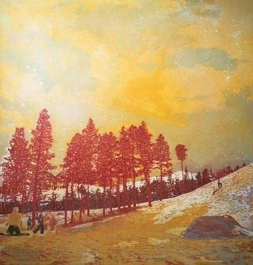
Name of Artist: Peter Doig
Name of Painting: Orange sunshine
Date: 1995
Made of: Oil on Canvas
Size: 278×201 cm
What I see: This picture stood out for me because how colors (mostly shades of yellow and blue) and lines where used to harmonize so well to make this calming piece of art. There is a lot of variety found in this picture as it resembles nature, while it has snowy texture all around. Emphasis was also found in this picture, which was in my opinion the dynamic and amazingly beautiful sky contrasting with all the different variations of strong yellow colors and its harmony. Some of the minor principles and elements were movements and space.
This pictures reminded me of the cold winter nights I spent in the mesmerizing dark forest with my family, where we had a big trailer and stayed in for few weeks. The hills were covered in chunks of pure white snow and those beautiful big trees with branches sticking out of the sides where those little birds would sing in the morning, while in the night we would hear in the distance wolves howling.
“Doig draws from memories of his childhood spent in Canada to construct nostalgic scenes of ski-trips and nature that pay equal attention to both figures and landscapes. His paintings, though representative of realities, invite viewers to question whether his subject matter is gathered from public realms or personal or shared experiences. Doig’s progression from natural, largely uninhabited, landscapes to populated architectural scenes reflect on the same physical progressions of modern civilization.”
Source
https://ocula.com/artists/peter-doig/?gclid=CPT-o4212s8CFUQaGwodQ3sJWg
Richard Diebenkorn

http://www.richarddiebenkorn.net/paintings/diebenkorn_landscape_figurative/ingleside.htm#.WADhr-B96hc
Name of Artist: Richard Diebenkorn
Name of Painting: Ingleside
Date: 1963
Made of: Oil on Canvas
Size: 208×177 cm
What I see: I chose this picture because for me it was the nicest looking one produced by Richard Diebenkorn. The picture contains a lot of cold but calming color, variety between the nature and the modern world and also unity. I think that the variety of the both worlds have been presented marvelously with the usage of colors and lines. The texture is also a big part of this picture, which really adds to the whole picture by making it complete. One of the examples is the road. It is worn out by all the usage of it and that is how the texture adds to the whole picture. Some minor things which are found in this picture is the usage of the value between the different things in the picture. Also, this picture does remind me of hot summers spent with my family at the coast, driving around the amazing coastline viewing beautiful beach houses.
Compare and Contrast
Differences
Orange Sunshine: Nature (Large enough to tell a story)
Emphasis
People
Winter (Seasons)
Movements (Sway of the trees)
Harmony
Ingleside:
Value
Unity
Scale
Shape
Similarities:
Variety
Colours
Line
Form
Texture
Space
Orange Sunshine: Nature (Large enough to tell a story)
Emphasis
People
Winter (Seasons)
Movements (Sway of the trees)
Harmony
Ingleside:
Value
Unity
Scale
Shape
Similarities:
Variety
Colours
Line
Form
Texture
Space
My Artwork

Hue Colour Wheel

|
|

|
|
In class we have learned about judging painting intensity, hue and value. We have made colour wheels which have helped us understand how to judge paintings colours and contrasts. We have made a pattern piece using opposite colors from which have been displayed to get the full grasp of judging the intensity, hue and value on a painting. Afterwards we have started to take inspiration from one of the pictures we have taken of the school. After choosing our favorite picture we made drafts which will have showed our thinking about developing new ideas and how we can incorporate all of them into making a final artwork which consists of every single one even if it's barely noticeable. We have also took inspiration from the artists we have analysed their pictures ad incorporated those ideas into our own to make it that little bit more interesting.

|

|

|
(The pictures above will be analysed from left to right)
1.This picture has a use of elements which consist of line, shape, colour, value and space. On the other hand this picture uses principles which consist of variety, emphasis which would be the tree and also contrast when being compared with the picture i have took inspiration from. The main ideas of this picture which I have made was to use contrast to see if the parts of the picture will harmonize or will look like some random scribbles.
2. While I was making this picture it was my goal to incorporate an idea from the pictures of famous artists. The idea i have chosen to take inspiration was from Richard Diebenkorn's Ingleside with the road. I have used line, shape, colour, value and space when we are talking about elements of design. The way I have used colours and value in this picture was to contrast some colours which really stand out by themselves and even more when around other colours. On the other hand the principles which I have used were unity, variety and space.
3. This has been my first painting I have painted from my drafts, while doing it i was just experimenting with different types of painting ad use of different shapes and how they will compliment each other. From all the paintings I have painted I am the least proud with this one. Even though I know I could've done a much better job with all of my paintings. The principles and designes this painting uses are shape, line, colour, space, unity and variety.

For my final piece I have inverted how the tree, the road and the buildings have been positioned. I have made the tree the emphasis but while still making the other parts of the painting fulfill the different roles to make the final art piece as nice as it can be. The road now doesn't just go trough the middle it curves which makes it have a curved perception which made the road look unique when compared with my other pieces. When I was making the tree I was trying to make it as real-life as my abilities can go. I have added texture to make the effect like there are leaves I have also added some black accents across the whole tree. I have made this a day with a beautiful sunset. At the bottom you have the sun, and as we progress upwards you can see the rays it produces in all the different colour variations which just adds to the whole experience. The way I have structured the windows on the buildings was something I have dreamed of. Just wacky shapes on large buildings was one of my weird dreams I wanted to accomplish, and I did it in this picture. At the top you can see how the sunset is low enough to see some stars peek trough the grey sky. This picture uses almost every principle and element I have used in my draft. Overall I am happy how the painting turned out but there is still room for improvement.
Reflections
What Went Well
I think during this unit i have had a lot of mistakes and I think i have massively improved from them. But one thing i have done well is my time management. During this unit I have planned out all of my work in a manner which will leave me enough time to make my final artwork the best quality it can be while giving myself to finish my drafts. I wished my drafts were of higher quality but because of the deadline that has been set. I have estimated the quality of my artwork with the amount of time we had quite incorrectly which made myself struggle during class and had to come in break time to add details and to properly finish my artwork. The other thing I did well was taking inspiration from the artwork of the famous artists. One of my draft has the same idea as Richard Diebenkorn's Ingleside. We have used the road as the main idea. Which made my artwork look that slight bit better than it would've without it.
Even Better If
In my opinion I think it would've been better if I had drew sketches before painting my drafts while being in the process of making my drafts and choosing how to make incorporate those ideas into my final art piece I didn't do sketches for my drafts which made them look not as neat and overall of a lower quality than what it coulee been if I actually did incorporated sketches. I have found out the mistake I made with not doing the sketches butt I realized it before doing my final art piece making my artwork look that slight bit better if I didn't have it. Also I think I could've been little bit moire focused during class because it would've made me think more efficiently. That was also the reason why I didn't realize that I made the mistake of not making sketches. Overall I am little bit mad at myself for not realizing my mistakes a little but faster because it would've increased my grade, but the good thing is that I have learned from those mistakes so I don't do them next time when we have a similar project.
Overall
During this unit I have had my ups and downs (mostly downs). I have reflected upon them to make myself be a better artist overall. The effort I have put into this unit was minimalistic to what I can do if I put my mind to it. My artwork was very bad as I was not being focused through the unit which made my quality of artwork significantly drop. Next time when we will be doing the same or similar unit I will be sure to sketch my painting first and fully think about how my designs will fit with my idea. I have still a lot of practice to do but I now know how to improve upon them to become a better artist.
